The Role of Design in Effective Marketing: Why Aesthetics Matter More Than Ever
Have you ever walked into a store and turned around immediately because it felt cluttered or uninviting? Marketing works the same way. Before a customer ever reads a single word of your sales copy, they have already judged your brand based on how it looks. Design is not just about making things pretty; it is the silent language of your business. It is the bridge between a vague idea and a memorable brand experience. In this guide, we will explore why design is the backbone of your marketing strategy and how you can leverage it to drive growth.
The First Impression: Why Design Is Your Business Face
Think of your website or your social media profile as your digital storefront. Within milliseconds, a human brain processes visual information and makes a snap judgment about your credibility. If your site looks like it was built in 1999, the user assumes your business practices are stuck in the past too. Design is your first introduction, and you rarely get a second chance to make a first impression. A clean, professional look signals reliability. It says that you care about the small details, which implies you care about the customer experience as well.
Psychology of Visuals: How Colors and Shapes Influence Decisions
Why do we associate blue with banking and red with fast food? This is not a coincidence. It is the result of deep psychological associations built over decades. Understanding the science behind visual stimuli can turn your marketing from a guess into a strategy.
The Emotional Impact of Color Theory
Colors speak louder than words. When you choose a palette for your brand, you are essentially setting the mood for your customers. Blue often denotes trust and security, which is why financial institutions love it. Yellow is associated with optimism and caution, often used to grab attention. When you align your colors with the specific emotion you want your customers to feel, you create a subconscious bond with them before they even understand your product.
Shape Psychology and Brand Perception
Shapes carry their own hidden meanings. Rounded edges feel friendlier and more approachable. Sharp angles suggest precision, strength, or high technology. If you are selling a luxury software suite, you might lean toward sleek, sharp geometric lines. If you are selling children toys, you want soft, rounded shapes. Your logo, icons, and layout should all reflect the personality of your brand.
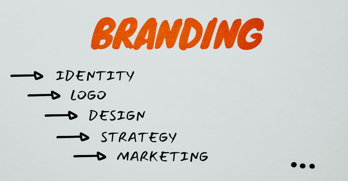
Building Brand Identity Through Consistent Design
Imagine meeting someone who changes their entire personality and appearance every time you see them. You would never feel like you truly know them. Brands are no different. Consistency is the secret sauce of brand recognition.
Why Consistency Creates Trust
When your Instagram feed matches your email newsletter, which matches your landing page, you build a sense of familiarity. Familiarity breeds trust, and trust is the ultimate precursor to a sale. If your design changes wildly across different platforms, you look disorganized, which makes customers hesitant to hand over their credit card info.
The Power of Visual Assets
Creating a library of consistent visual assets like icons, fonts, and photography styles ensures that every piece of marketing content feels like it came from the same source. This is what we call a cohesive brand language.
Design as a Tool for Conversion Optimization
Design is not just for show; it is an engine for performance. You can use design elements to lead your customers toward specific actions, effectively nudging them along the sales funnel.
Guiding the User Eye With Visual Hierarchy
Visual hierarchy is the art of arranging elements in a way that implies importance. By using size, color, and positioning, you can dictate exactly what the user sees first, second, and third. A massive headline captures interest, while a smaller subhead provides context, and a bold button invites action. If everything on your page is the same size and color, the user eye gets lost, and they leave.
The Critical Role of Call to Action Buttons
Your call to action is the goal line. Your design should make it impossible to miss. Use contrasting colors, white space, and clear language to ensure that when a customer is ready to buy, they don’t have to hunt for the button. If the user has to think about where to click, you have already lost them.
Mobile Responsiveness and Modern UX Design
In a world where most traffic happens on smartphones, mobile design is no longer optional. It is the default. If your site does not look good on a phone, it does not matter how good your product is. A good mobile experience requires rethinking the layout for smaller screens. Touch targets need to be big enough to tap, and information needs to be prioritized for quick consumption. If your mobile design is clunky, your bounce rate will skyrocket.
Storytelling Through Infographics and Visual Data
Data is often dry and overwhelming. When you present a paragraph of statistics, readers check out. When you present that same data as a beautiful infographic, you make the information digestible. Design transforms facts into a story. It helps the audience visualize the impact of your product or service without making them work for it.
Balancing Creativity With Functional Utility
There is a constant tension between wanting your site to look unique and needing it to work for the user. Sometimes designers get so caught up in being artistic that they forget the primary goal of the website is to communicate or sell. Always prioritize functionality. A beautiful site that is impossible to navigate is a failure in the context of marketing.
The Impact of Minimalism on Modern Marketing
Less is often more. The rise of minimalist design is a reaction to the digital noise we face every day. By stripping away the clutter, you give the user brain a chance to rest and focus on what actually matters. Minimalism emphasizes high quality images, generous white space, and clear typography. It says that you are confident enough in your message that you don’t need to hide behind flashy animations or excessive text.
Common Design Mistakes That Kill Marketing Campaigns
We see the same mistakes over and over. Using too many fonts, picking colors that clash, ignoring the importance of white space, and low resolution imagery are all fatal flaws. Every one of these issues erodes the user trust. If you are not a designer, invest in professional templates or hire someone who understands the balance of art and commerce. Your marketing budget is wasted if the delivery mechanism is poorly designed.
Conclusion
At the end of the day, marketing is about communication. Design is the vehicle that carries your message to your audience. When you invest in good design, you are investing in the way your customers perceive your value, your professionalism, and your personality. It is the difference between a brand that is easily forgotten and one that becomes a household name. Stop treating design as an afterthought and start using it as the strategic asset it truly is. By focusing on consistency, psychology, and user experience, you create a marketing presence that does not just look good, but performs consistently well in a competitive landscape.
Frequently Asked Questions
1. Does good design really impact sales directly?
Yes, absolutely. Good design builds trust, and trust is a key driver for conversion. A professional looking site reduces friction and encourages users to complete their purchase.
2. How do I choose the right color palette for my brand?
Look at your industry and your target audience. Research color psychology to identify which emotions you want to evoke, and stick to a maximum of three core colors to keep your brand image clean and focused.
3. What is white space and why does it matter?
White space is the empty area around images and text. It is crucial because it prevents information overload and allows the user eyes to focus on the most important parts of your content.
4. Is it possible to be too minimalist in design?
Yes. If you go too far, your site might end up looking barren or confusing. Always ensure that the minimalist approach still provides all the necessary information and navigation tools the user needs to complete a purchase.
5. Should I follow design trends?
Follow trends with caution. While it is good to stay modern, your brand identity should be timeless. Adopt design elements that improve user experience, but do not change your entire brand look just because a new trend appeared on social media.